Regards,
Adam
Moderator: t20569cald


BSears wrote:
I should kick my own ass for getting off the list.
but if things take a turn for the better....

Todd, that is looking fantastic.I know we're seeing the prototype - can you tell us what might differ for the final product, if anything?
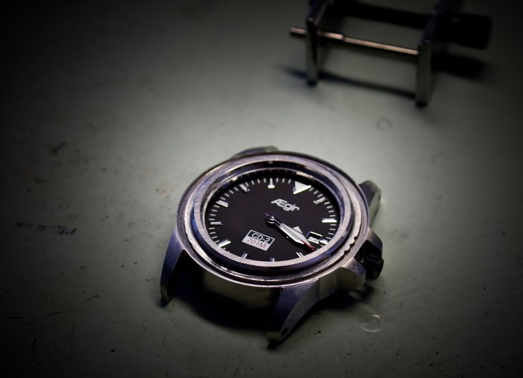
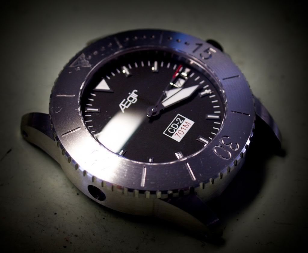
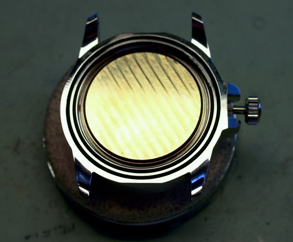
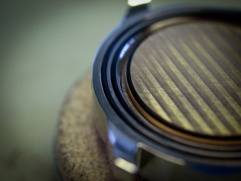
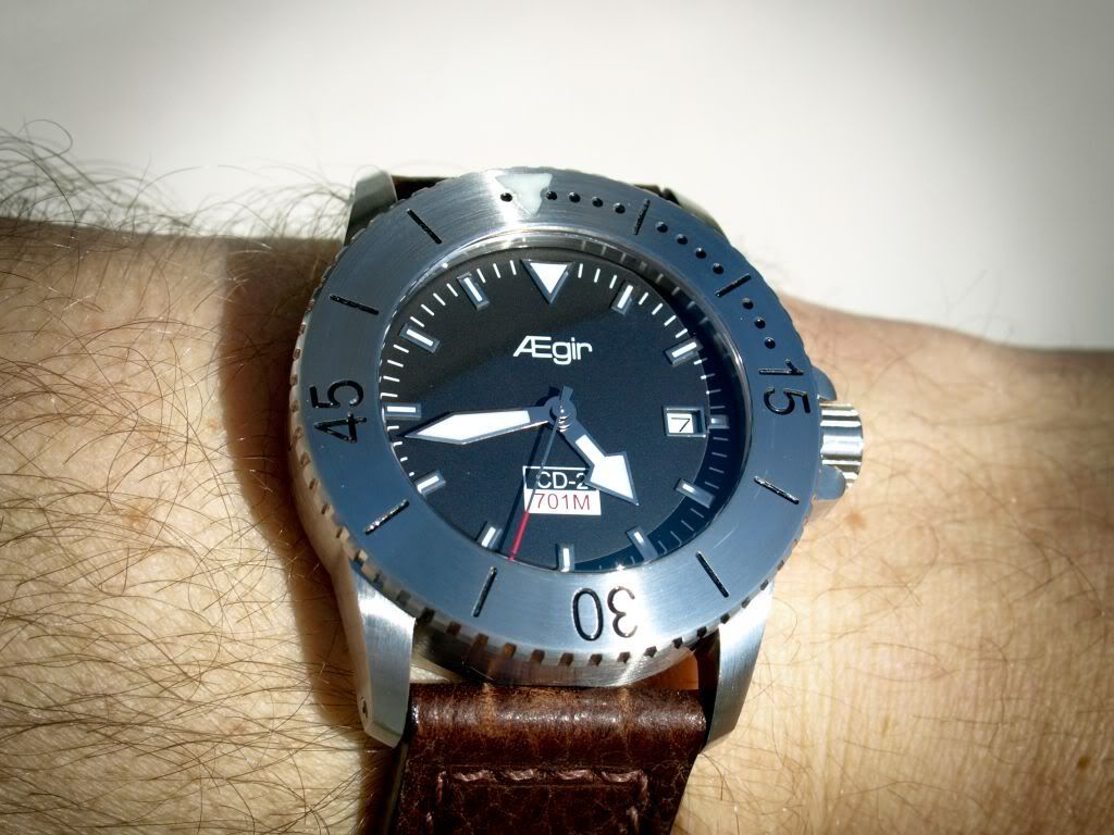
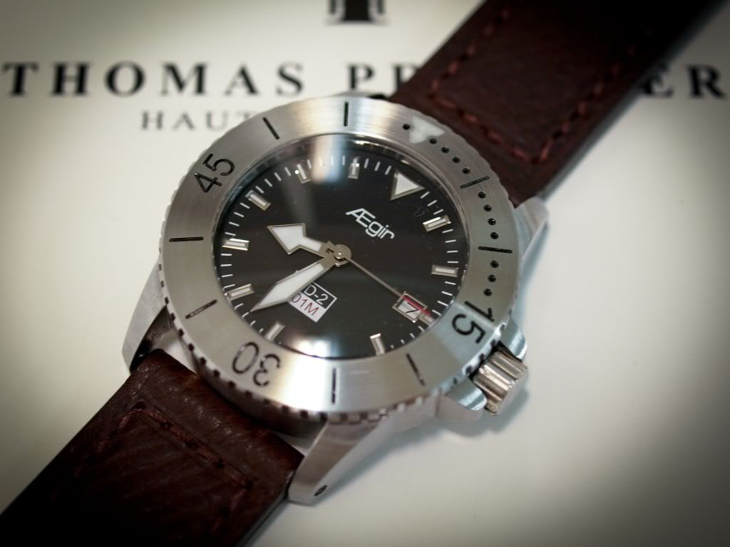
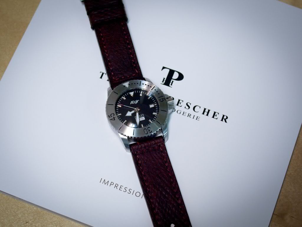


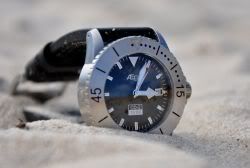
The font is different on the CD-2 and 701M for the general release, but Ægir remains the same.FlyPenFly wrote:I like everything about this watch except the typography. To be honest, the typography for the branding and labeling seems to the weakest point of this piece which is a shame because all the other parts of this watch seem to be so extremely well thought out and made. Did you hire a graphic designer to handle laying out the type?
Look at Panerai or even Omega to see how handle the typographical relationship even on print busy dials. It's that last mile which makes those watches classics vs micros.
I don't mean to sound harsh and I hope it's taken as constructive rather than just simply criticism.


If you read through this thread, you will find i scraped 100 German made dials, due to an alignment issue. A small one at that.FlyPenFly wrote:Hi there, to give you background, I'm just coming from a former graduate graphic designer TA perspective.
There are some things like tracking, kerning, margins, alignment, and just general breathing room that is lacking on this initial design. I don't know what your production schedule is like so it might be too late for this round.
In general, I think you should hire a graphic designer with a strong type background to go over the type setting. It seems like it's no big deal but it's what separates IMO the big boys from the upstarts. But I do realize I have a bias because I'm coming from a design background perspective. If you want, PM me and I can put you in touch with some friends who still do freelance.
I think you might benefit from going through a branding exercise to choose the typeface. Choosing the typeface might be one of the last steps though, not the first.
Ha! Not quite, though they did both pass away in 1996. My father's contributions to the world of graphic design were a wee bit more modest than Rand's (that man was a giant in the industry).FlyPenFly wrote:Adam, is your father really Paul Rand???
That might explain why you're such a baller.

I see what your saying, and dont entirely disagree.FlyPenFly wrote:Well without getting too deep into it, have you thought about the significance of the relationship between the logo and your specific product labeling? Why you're using specific colors and spacing? Look at Audemars Piguet or Vacheron, or even Montblanc. They're throwing quite a lot of money into type beyond just simply "design".
IMO, there is no such thing as a "cool" font, there are just fonts and fonts that fit your design language, your brand value goals, and your long term product plan. If you're using a precanned font and not creating your own for your brand, that might be part of the problem although not a deal breaker.
But really, I've been out of this space for a long time but just on my initial view, to me, again... I hate to sound like a debbie downer but it doesn't seem quite as well thought out as the rest of the watch. I think you should hire a graphic designer.
To me, type is a beautiful world where I just know the very simple basics but once you have a even a small glimpse of that world, it's hard to not be critical of any design endeavor that doesn't fully realize it.

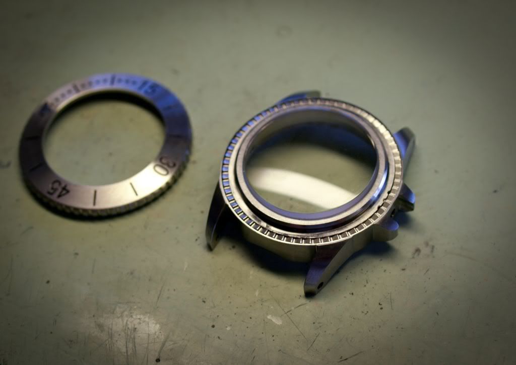
It just so happens that they are changed, but its pdf, and i cant seem to post it up here as Photobucket wont take it.toxicavenger wrote:I think Jae is right, I do like how the Ægir is done but the CD-2 and 701M are the only ones that IMO could use a little change. I don't know how they should be changed, so my opinion might not be worth much.
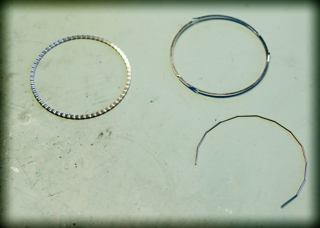
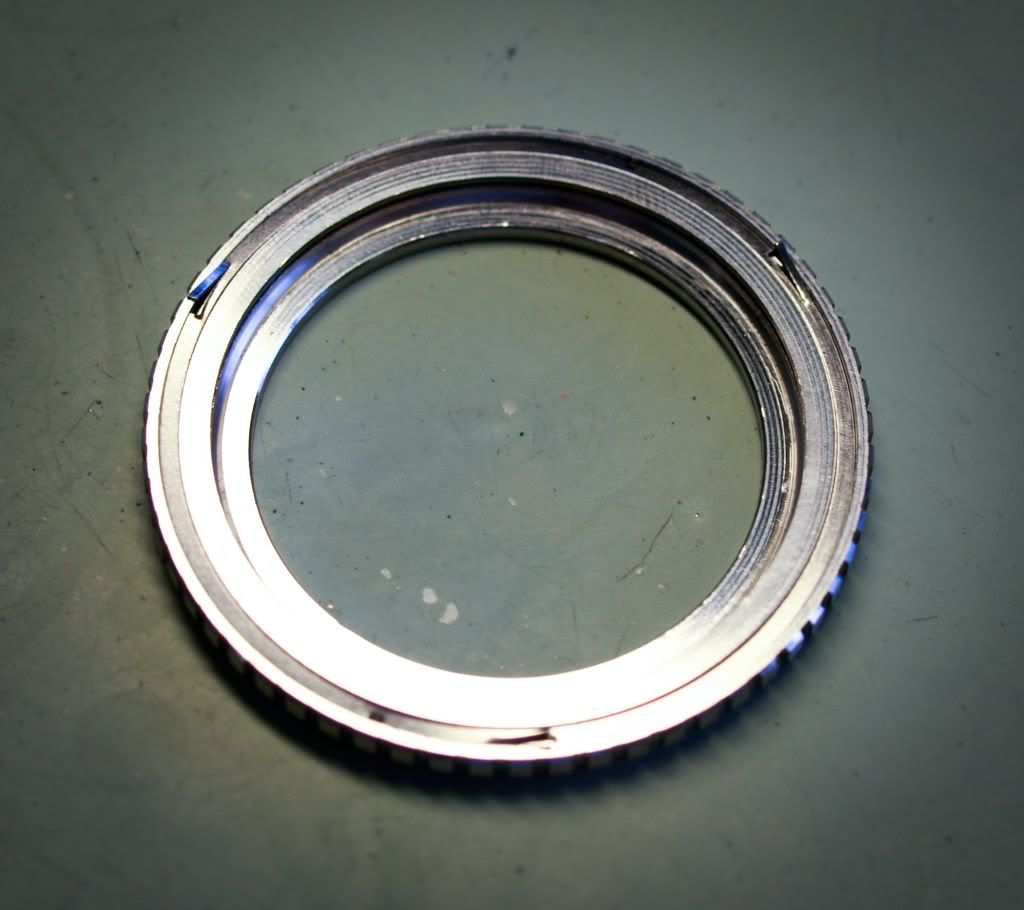
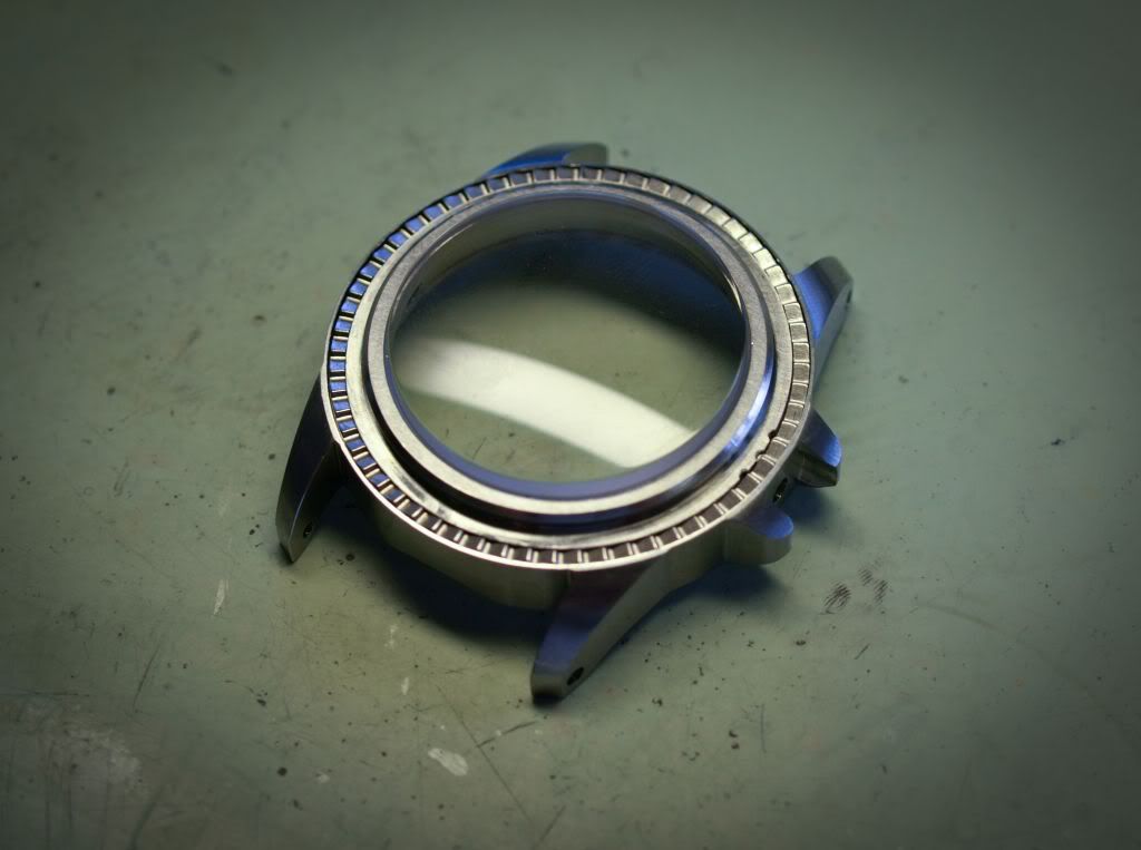
Either way I like all the thought you have put into the watch and the execution is amazing! Ever step of the way you keep coming up with more great ideas like the sapphire bezels.
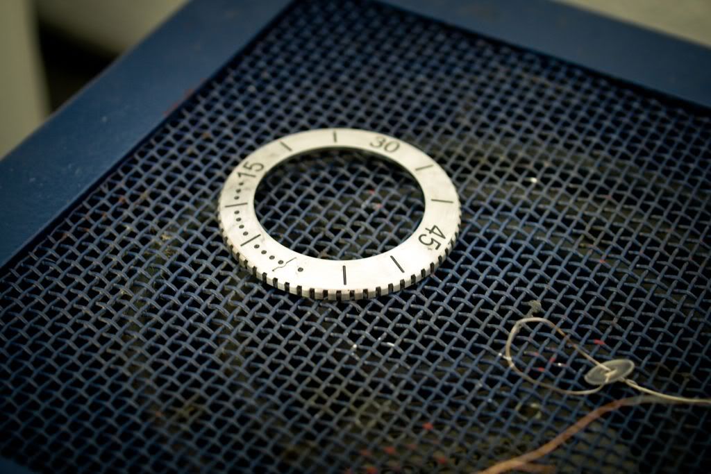
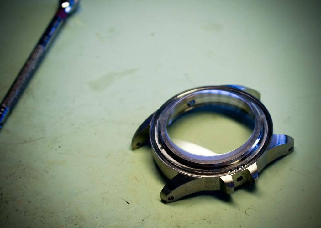
Thanks for showing us the process involved with building a watch!!!
Good to hear Todd and keep up the amazing work. I hope your new location you moved to is a better setup.t20569cald wrote:It just so happens that they are changed, but its pdf, and i cant seem to post it up here as Photobucket wont take it.toxicavenger wrote:I think Jae is right, I do like how the Ægir is done but the CD-2 and 701M are the only ones that IMO could use a little change. I don't know how they should be changed, so my opinion might not be worth much.
Either way I like all the thought you have put into the watch and the execution is amazing! Ever step of the way you keep coming up with more great ideas like the sapphire bezels.
Thanks for showing us the process involved with building a watch!!!
It is better though and will be more liked than the current.


Users browsing this forum: No registered users and 62 guests